
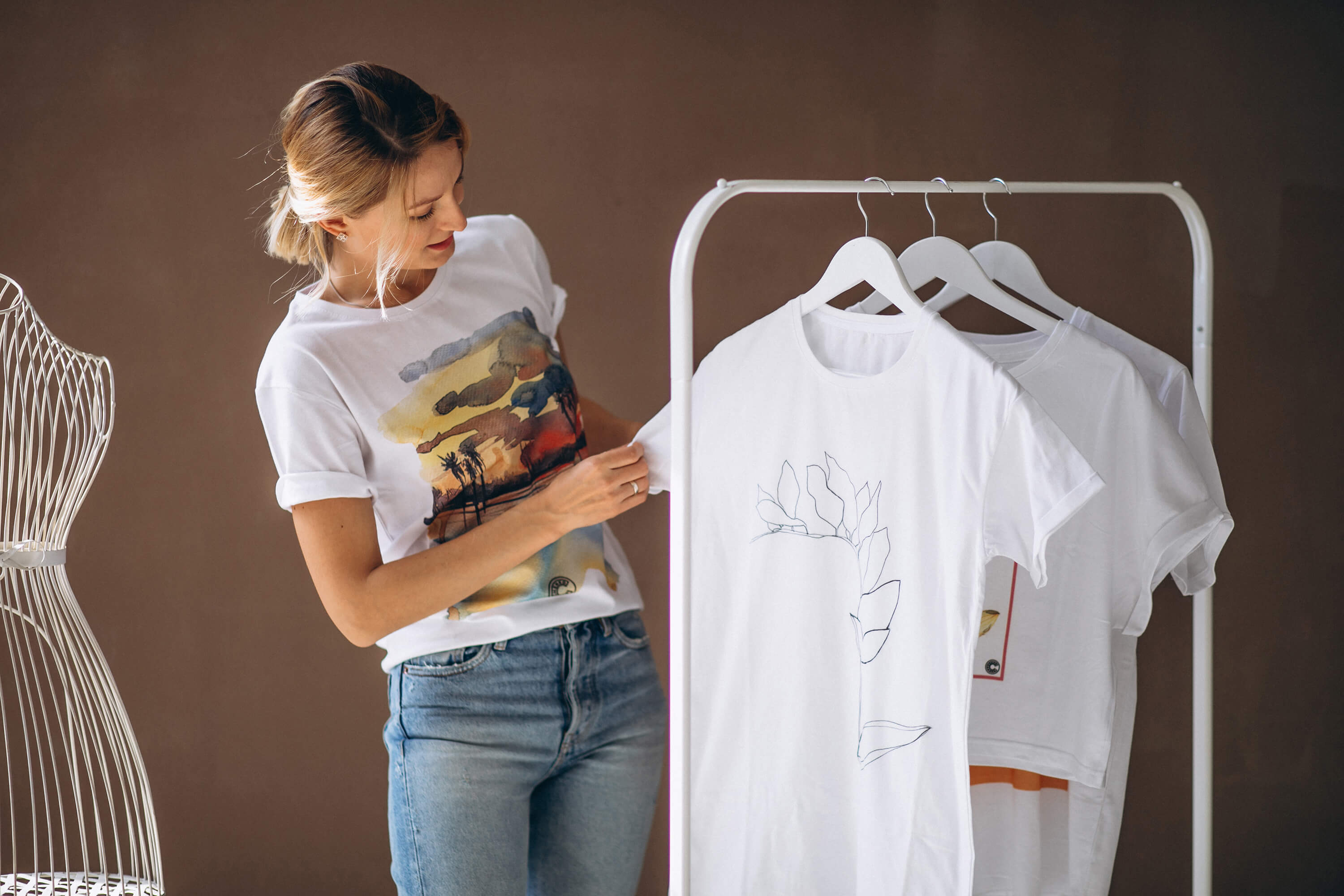
This Module is focused on the development of your brand's visual identity, which plays a pivotal role in shaping how your t-shirt brand is perceived by your target audience. This module guides you through the process of creating a strong visual identity that resonates with your brand's essence. By the end of module, you'll have a solid understanding of how to craft a distinctive visual identity for your t-shirt brand, ensuring that your designs resonate with your target audience and create a lasting brand impression.
1 Defining Your Visual Identity
In this section, you'll learn the fundamental steps in defining your t-shirt brand's visual identity. It's the starting point for crafting a cohesive and memorable brand image. Here's a detailed explanation of this section, accompanied by examples:
Understanding Your Brand:
Before you dive into the visual elements of your brand, you need a clear understanding of your brand's essence. This involves defining your brand's personality, values, and mission. Are you a playful and youthful brand, or do you convey sophistication and luxury? Are your values centered around sustainability or innovation?
Example: Consider the brand Patagonia, known for its commitment to environmental sustainability. Their visual identity reflects their values through earthy tones, nature-inspired graphics, and a logo featuring a mountain range, aligning perfectly with their mission.
Target Audience Analysis:
Your visual identity should resonate with your target audience. Analyze your audience's demographics, interests, and preferences. Are they young and tech-savvy, or are they more traditional and conservative?
• Example: Nike's visual identity is dynamic and bold, perfectly aligned with its athletic and youth-oriented target audience. The iconic swoosh logo and vibrant imagery appeal to sports enthusiasts and athletes.
Brand Personality:
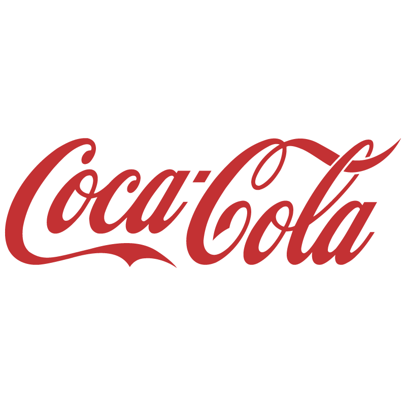
Define your brand's personality traits. Is your brand adventurous, friendly, professional, or innovative? These traits will guide the visual choices you make. Example: Coca-Cola's visual identity exudes warmth and friendliness, consistent with its brand personality. The use of red, classic script font, and images of people sharing a Coke reflects this personality.
Brand Values and Mission:
Your brand's values and mission should be evident in your visual identity. If your mission is environmental conservation, your visual identity should reflect sustainability and nature.
• Example: The Body Shop's visual identity aligns with its values of natural and ethical beauty products. Earthy colors, leafy imagery, and an eco-friendly logo all convey these values.
Competitor Analysis:
Study your competitors' visual identities. This will help you identify gaps in the market and ensure your brand stands out.
• Example: In the tech industry, Apple's visual identity is sleek, minimalistic, and futuristic. It sets them apart from competitors like Microsoft, which often adopts a more corporate and conventional visual style.
Mood Boards and Inspiration:
Create mood boards with images, colors, and fonts that resonate with your brand's essence. This visual inspiration will serve as a foundation for your brand's visual identity.
Example: Pinterest's visual identity emerged from its mood boards filled with pins, illustrations, and images. The platform's visual aesthetic reflects its role as a visual discovery tool.
Brand Storytelling:
Your visual identity should tell a story about your brand. Craft a narrative that captures your brand's journey, values, and aspirations.
- Example: TOMS Shoes' visual identity is built around its "One for One" mission to provide a pair of shoes for every pair sold. Their visuals often feature shoe giveaways and stories of the communities they impact.
Creating Brand Personas:
Develop brand personas that represent different facets of your brand. For example, you might have a "playful" persona and a "professional" one, each with distinct visual attributes.
- Example: Coca-Cola has multiple brand personas. Its "Coca-Cola Classic" persona is associated with nostalgia and celebration, while its "Diet Coke" persona embodies a modern, health-conscious image.
By defining your visual identity based on these foundational elements, you'll create a brand image that authentically represents your brand's personality, resonates with your audience, and effectively communicates your values and mission.
2 Logo Design
This section focuses on the intricacies of logo design, a critical element of your t-shirt brand's visual identity. Your logo is the visual symbol that will become synonymous with your brand. Here, we'll explore the various types of logos and provide examples to illustrate each type:
Understanding Logo Types:
Logos come in different forms, each with its own characteristics and applications. The four primary types of logos are wordmarks, letterforms, logo symbols, and mascot logos.
Wordmarks (Logotypes):
Wordmarks are logos that consist of the brand's name written in a specific typeface or font. They rely on typography to convey the brand's identity. These logos are straightforward and emphasize the brand's name.
- Example: The "Coca-Cola" logo is a classic wordmark. It prominently features the brand name in a unique and recognizable script font. This logo is all about the brand's name, making it instantly identifiable.
Letterforms
Letterform logos use the initial letter or letters of the brand's name as the primary design element. They can be highly stylized and creative, focusing on typography to create a memorable visual.
- Example: IBM's logo is a prominent letterform logo. It uses the initials "IBM" in a distinctive, bold typeface. This logo represents the brand efficiently with a simple yet impactful design.


Logo Symbols (Brand Marks):
Logo symbols, also known as brand marks or pictorial marks, use graphic icons, symbols, or images to represent the brand. These symbols are often associated with an object or concept relevant to the brand.
- Example: Apple's logo, an apple with a bite taken out of it, is a famous logo symbol. The apple is an instantly recognizable image and effectively represents the brand's name.

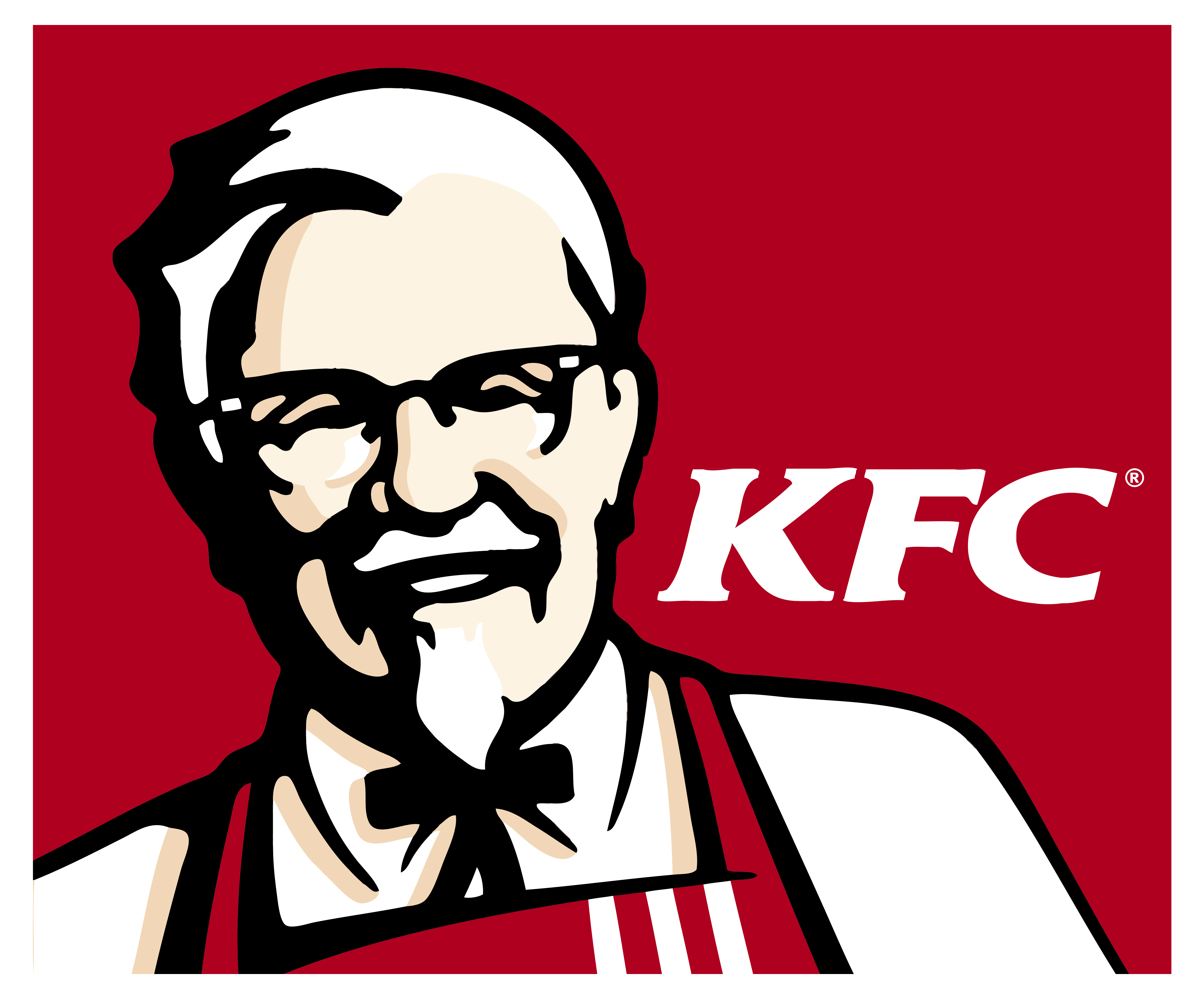
Mascot Logos:
Mascot logos feature illustrated characters that act as visual representatives of the brand. These characters can be fictional or real and are designed to connect with the audience on a personal level.
- Example: The KFC logo features Colonel Sanders, the brand's founder, as a mascot. Colonel Sanders serves as a friendly and recognizable face for the brand, adding a personal touch.

Choosing the Right Logo Type:
The choice of logo type should align with your brand's personality, values, and target audience. Consider the message you want to convey and how each logo type reflects that message.
Custom Typeface vs. Existing Fonts:
When creating a wordmark or letterform logo, you can choose between using an existing font or creating a custom typeface. Custom typefaces offer unique and exclusive designs but require professional design expertise.
Custom Typeface:
A custom typeface, often referred to as a custom font or bespoke font, is a typeface that is created specifically for a particular brand, project, or individual. These typefaces are designed from scratch or modified extensively to suit the unique requirements and identity of the entity they are created for.

Existing Fonts:
Existing fonts, also known as off-the-shelf fonts or typefaces, are readily available fonts that are designed for general use. They are created by type foundries and can be licensed for various projects.


The choice between a custom typeface and existing fonts depends on the specific needs of a project or brand. Custom typefaces offer unparalleled uniqueness and brand alignment but come with a higher cost and time commitment. Existing fonts are readily available, cost-effective, and suitable for many applications but may lack the distinctiveness of a custom design. Brands and designers must carefully consider these factors when making their typographic choices to achieve the desired impact and recognition.
Logo Design Process:
The logo design process is a crucial step in establishing a brand's visual identity. It's a creative journey that involves several stages, including ideation, sketching, digital design, and iterations. Each of these stages plays a vital role in crafting a logo that effectively represents a brand's identity and values. Let's explore each step in detail:
1. Ideation:
- The logo design process begins with ideation, where the designer or design team gathers information about the brand, its values, mission, and target audience. This stage is critical for understanding the core essence of the brand, as the logo should be a visual representation of these elements
- Brainstorming and research are essential during this phase. Designers explore various concepts, themes, and visual styles that might resonate with the brand. They consider the brand's history, industry trends, and competitive landscape to identify opportunities for differentiation.
- For example, if a brand is eco-friendly and sustainable, the ideation process might focus on concepts related to nature, organic shapes, or green symbolism.
2. Sketching
- Once the ideas and concepts are fleshed out during the ideation phase, the next step is to sketch preliminary designs on paper. This stage allows designers to explore the visual representation of their ideas in a freeform manner.
- Sketching is an essential part of the creative process because it encourages designers to experiment with different shapes, symbols, and typography styles. It helps in quickly visualizing and refining ideas
- Designers might create multiple rough sketches of potential logos, exploring variations and compositions. Some sketches may be discarded, while others will serve as the foundation for the digital design phase.
- Sketches provide a tangible starting point for discussing and refining ideas with clients or team members
3. Digital Design:
In this stage, designers take their refined sketches and translate them into digital formats using graphic design software such as Adobe Illustrator or CorelDRAW.
The digital design phase involves precise detailing, fine-tuning of shapes, selection of colors, and experimentation with typography. Designers work to create a clean and scalable logo that can be used across various mediums and sizes.
This is also the stage where designers may incorporate feedback from the client or team members to make necessary adjustments to the logo concept.
Designers ensure that the logo is versatile, ensuring it works in both color and grayscale, and on different backgrounds.
4. Iterations:
The logo design process often involves multiple iterations and revisions. Designers work closely with clients to gather feedback and make refinements to the logo.
Iterations can involve changes to color schemes, font choices, alignment, proportions, or overall design elements. The goal is to create a logo that fully captures the brand's identity and resonates with the intended audience.
This back-and-forth collaboration ensures that the final logo is a perfect representation of the brand's vision and values.
A style guide may also be developed, outlining the correct usage of the logo, including color codes, typography, and minimum size requirements. This ensures consistency in branding across all applications. In summary, the logo design process is a multi-step journey that requires creativity, research, collaboration, and attention to detail. It's not just about creating a visually appealing image; it's about distilling a brand's essence into a symbol that communicates its identity and values effectively. This process ensures that the final logo is a powerful and memorable representation of the brand that can be used consistently across various media and contexts.
3 Color Palette Selection
Selecting the right color palette for your t-shirt brand is a crucial step in establishing a strong visual identity. Colors evoke emotions, convey messages, and create a sense of connection with your audience. In this section, we'll delve into the process of choosing a color palette, understanding color psychology, and providing examples for clarity:
1. Colors and Emotions:
Blue: Blue is often associated with feelings of trust, calmness, and tranquility. It is frequently used in corporate logos and branding to convey professionalism and reliability. For example, many tech companies, such as IBM and Facebook, use shades of blue in their branding to instill a sense of trustworthiness.
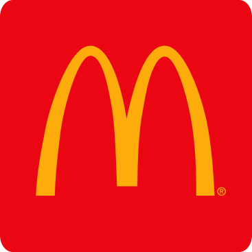
red Red is a color that typically signifies passion, energy, and excitement. It can also evoke feelings of love, urgency, or danger. Fast-food chains like McDonald's use red to stimulate appetite and create a sense of urgency for quick service.
Green: Green is closely associated with nature, growth, and health. It often symbolizes balance, harmony, and freshness. Environmental and organic product brands use green to emphasize their commitment to sustainability and well-being.
Yellow: Yellow is known for its cheerful and optimistic qualities. It represents happiness, warmth, and energy. Brands like McDonald's and Best Buy incorporate yellow to create a welcoming and joyful atmosphere.
Purple: Purple is often linked to creativity, luxury, and spirituality. It can convey a sense of sophistication and mystery. Companies like Cadbury and Hallmark use purple in their branding to evoke a feeling of indulgence and sentimentality.
Orange:Orange is associated with enthusiasm, vibrancy, and adventure. It can stimulate a sense of fun and excitement. Brands like Fanta and Home Depot use orange to capture attention and convey a sense of action.
BlackBlack represents sophistication, elegance, and power. It is often used in luxury brands and high-end products to convey exclusivity and prestige. Examples include Chanel and Rolex
WhiteWhite signifies purity, simplicity, and cleanliness. It can create a sense of openness and clarity. Many healthcare and tech companies use white for its clean and modern connotations.
2. Application of Color Psychology:
Marketing and Advertising:Marketers use color psychology to influence consumer behavior. For example, using red for clearance sales to create a sense of urgency or green for eco-friendly products to convey sustainability.
Design and Branding: Graphic designers and branding experts carefully choose colors to align with a brand's personality and values, ensuring that the visual identity resonates with the target audience
Therapeutic Use: In psychology and therapy, color is sometimes used to elicit emotional responses or promote relaxation. This is known as color therapy or chromotherapy
Understanding the psychological effects of colors is essential for designers, marketers, and individuals looking to convey specific messages or create particular atmospheres through their use of color. Whether in branding, design, or personal expression, colors are a potent tool for influencing how people perceive and react to visual stimuli.
Creating a Mood Board:
Mood boards are visual collages that capture the essence of your brand. They include images, color swatches, and design elements that resonate with your brand's personality and values. Creating a mood board for colors in branding is a creative and essential step in the branding process. It not only helps you define your brand's visual identity but also ensures that the chosen colors effectively convey the desired mood and resonate with your target audience
4 Typography and Fonts
Typography plays a significant role in your t-shirt brand's visual identity. Fonts convey personality, readability, and brand consistency. In this section, we'll explore typography and fonts in detail, including various font categories and examples:
Understanding Typography:
Typography is the art and technique of arranging type to make written language legible and visually appealing. It encompasses font styles, sizes, spacing, and arrangements.
Font Categories:
Fonts are categorized into various styles, each with its unique characteristics. Common font categories include:
- Serif Fonts: These fonts have small lines or strokes (serifs) at the
ends of
characters. They often convey tradition, professionalism, and reliability
Example: Times New Roman. - Sans-Serif Fonts:Sans-serif fonts lack serifs and offer a clean,
modern, and
minimalistic look. They are often used for digital content
Example: Helvetica. - Script Fonts:Script fonts mimic cursive or handwritten styles, adding
a
personal touch and elegance to your brand.
Example: Brush Script. - Display Fonts:Display fonts are decorative and attention-grabbing.
They are
suitable for headlines and branding elements.
Example: Lobster - Monospaced Fonts:Monospaced fonts have equal spacing between
characters, making them ideal for coding and technical content
Example: Courier New.
Font Pairing:
Font pairing involves using two or more fonts together to create visual contrast and hierarchy. Pairing a bold font with a light, elegant script font, for instance, can enhance readability and aesthetic appeal.
Brand Consistency:
Consistency in font usage across branding materials, including your logo, website, and t-shirt designs, is essential. It reinforces brand identity and recognition.
Accessibility:
Ensure that your chosen fonts are accessible to all users, including those with visual impairments. Consider factors like font size, spacing, and contrast.
Examples:
- Apple: Apple primarily uses the San Francisco font for its branding and product interfaces. San Francisco is a modern sans-serif font that aligns with Apple's sleek and minimalist design philosophy.
- Nike: Nike's logo features a custom-designed font known as the "Nike Font." This bold, italicized typeface conveys energy and athleticism, aligning with the brand's identity.
- Coca-Cola: Coca-Cola employs the "Spencerian Script" font for its logo. This script font adds a sense of tradition and authenticity, reflecting the brand's long history.
- Adobe: Adobe uses the "Adobe Clean" font for its branding and interface design. This sans-serif font offers clarity and professionalism, reflecting Adobe's commitment to creativity and innovation
- Disney: Disney's branding features a custom font known as "Waltograph." This playful script font embodies Disney's magical and whimsical brand image.
Selecting the right fonts for your t-shirt brand is essential for conveying your brand's personality and message effectively. Whether you opt for a classic serif font, a clean sans-serif font, or an elegant script font, consistency and readability should remain top priorities in your typography choices.
.png)